Love Percentage Chart – What Your Love Score Really Means
Got your love calculator result and confused about what it means?
Don’t worry.
This Love Percentage Chart explains every score from 0% to 100% in a simple way. Find your score, see which range it falls into, and discover the playful meaning behind your result.
You can also screenshot the chart, save it, or share it with your partner or friends. For more detail about interpreting different results, read our score meaning guide .
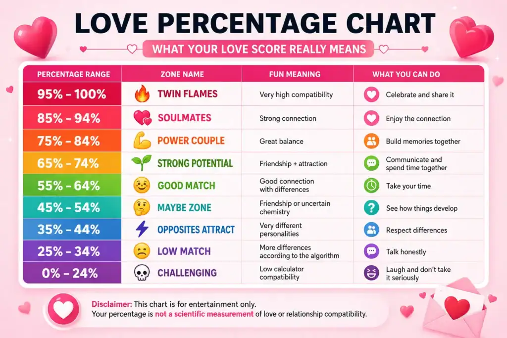
The Complete Love Percentage Chart
Detailed Breakdown of Each Range
95% – 100%: Twin Flame Zone 🔥
This is the highest range on the chart. According to the calculator’s entertainment algorithm, your names produced a very high compatibility score.
The playful interpretation may describe you as having similar energy, strong chemistry, or a natural connection.
- You understand each other’s humor.
- You enjoy spending time together.
- You naturally support each other.
- Friends may say you look great together.
Celebrate the result and share it if you want.
Just remember that even a 100% calculator score doesn’t replace communication, trust, or effort in a real relationship.
85% – 94%: Soulmate Zone 💞
This is another very high score range. The playful interpretation suggests a strong combination of friendship and attraction.
You might enjoy talking for hours, share similar interests, or simply feel comfortable around each other.
Enjoy the connection and continue getting to know each other.
A high score can be a fun reason to plan a date, but don’t treat it as a prediction of marriage or a lifelong relationship.
75% – 84%: Power Couple Zone 💪
Your result suggests strong compatibility according to the calculator.
Perhaps your personalities are different but work well together. One person may be more organized while the other is spontaneous, or one may be calm while the other brings more energy.
Spend time together, make memories, and support each other’s goals.
Different personalities can complement each other when both people communicate and respect one another.
65% – 74%: Strong Potential Zone 🌱
This range suggests a good balance of friendship and attraction in the calculator’s playful interpretation.
You may like each other but still be learning about each other’s personalities, habits, and interests.
Give it time.
Don’t assume a score in the 60s means something is wrong. Real relationships develop through actual experiences, not percentages.
55% – 64%: Good Match Zone 🙂
You have a moderate compatibility result.
You may enjoy each other’s company while still having a few noticeable differences.
Focus on what you have in common and take time to understand your differences.
You don’t need to agree on everything to enjoy spending time together.
45% – 54%: Maybe Zone 🤔
This is the middle of the chart, so the result doesn’t strongly favor either extreme.
The playful interpretation may suggest that friendship is stronger than obvious romantic chemistry—or that the calculator simply produced a middle-range score.
Don’t force anything.
If you have romantic feelings, real communication will tell you much more than the calculator can.
If you don’t, there’s nothing wrong with enjoying the friendship.
35% – 44%: Opposites Attract Zone ⚡
This range can be interpreted as having noticeable differences.
You might joke that you’re like fire and water: completely different, but potentially interesting together.
Respect each other’s differences.
Relationships between very different personalities can be enjoyable, but they require communication, patience, and compromise.
25% – 34%: Low Match Zone 😬
According to the calculator’s formula, your names produced a relatively low score.
That doesn’t mean you’re actually incompatible.
It simply means the letters and calculation rules produced this particular result.
Don’t panic.
If you genuinely like each other and enjoy being together, the number doesn’t change that.
0% – 24%: Challenging Zone 💀
This is the lowest range on the chart.
The calculator has produced a low compatibility score based on its programmed rules.
Meme it.
The important thing is not to let a playful score affect your real relationship.
How to Use This Chart
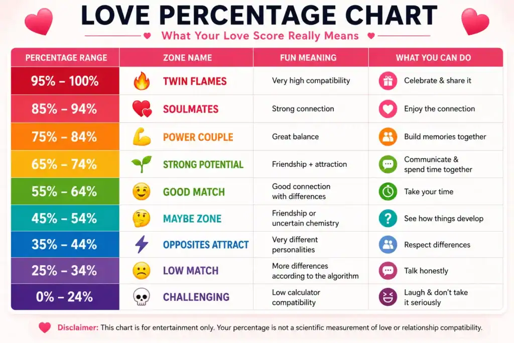
Using the chart is simple.
Example
79% falls into the 75%–84% Power Couple Zone.
The fun interpretation: you have strong compatibility and may balance each other well.
Plan a date. 💪❤️
Of course, the real relationship is still more important than the score.
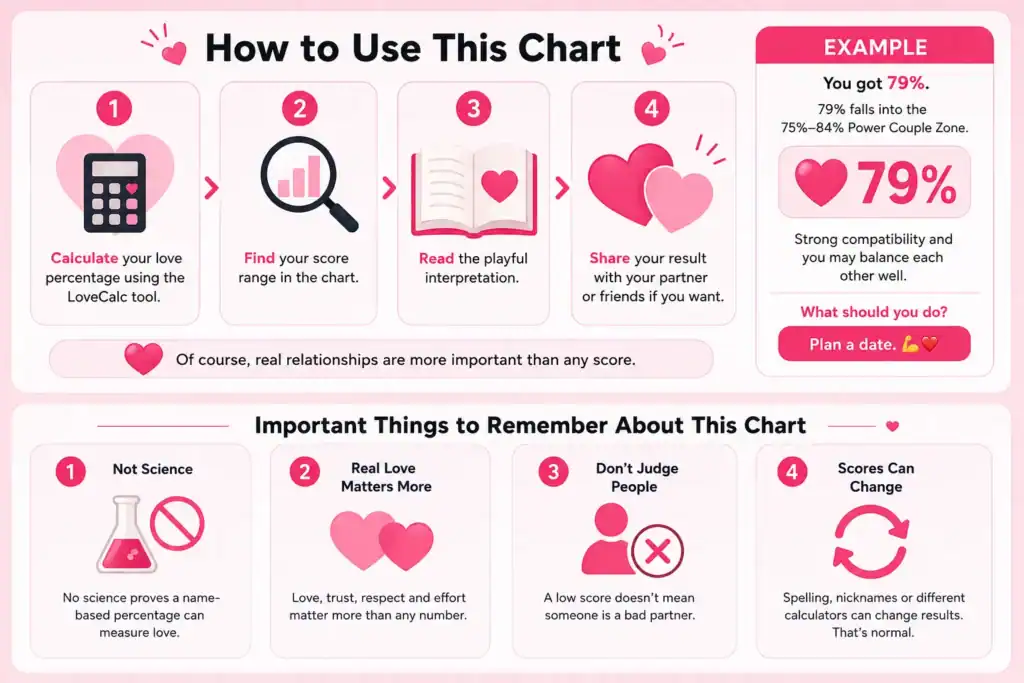
Important Things to Remember About This Chart
This Is Not Science
No scientific evidence shows that a name-based percentage can measure romantic compatibility.
LoveCalc is an entertainment tool, and this chart should be treated the same way.
Real Love Is More Important Than Any Percentage
A couple with a 40% calculator result can have an amazing relationship.
A couple with a 100% result can still have disagreements.
Communication, trust, respect, shared values, and effort matter far more than a number.
Don’t Use the Score to Judge People
If someone gets 25%, that doesn’t mean they’re a bad partner.
The result says something about the calculator’s formula— not about a person’s value.
Scores Can Change
Changing the spelling, using a nickname, adding a middle name, or using a different calculator can produce a different result.
That’s normal.
Don’t obsess over finding the “perfect” percentage.
Common Scores and What They Can Mean
Every result is different, but some scores can feel especially memorable.
FAQ About the Love Percentage Chart
Is 60% Good or Bad?
60% falls into the Good Match range on
this chart.
It’s neither a guarantee nor a warning. It’s simply a fun
interpretation of the score.
Should I Break Up If We Got 30%?
Absolutely not.
Don’t make a serious relationship decision based on an
entertainment calculator.
If you’re unhappy in a relationship, focus on the actual
issues—not the percentage.
What’s the Average Love Percentage?
There is no scientifically established
“average love percentage.”
Every calculator uses its own formula, so results from
different websites cannot reliably be combined into one
meaningful average.
Can I Trust This Chart?
Trust it for fun.
Don’t use it to make important decisions about your
relationship or future.
Pro Tip: Make Your Score Shareable
Love percentages are more fun when you can share them.
After calculating your result, you can save a screenshot or use the result-card feature if available.
Just remember that the result is meant to be playful—not a serious relationship assessment.
Final Words
The Love Percentage Chart is simply a guide to help you understand your calculator result.
Think of it like a horoscope or a fun personality quiz:
A simple way to remember the ranges:
Real compatibility is built, not calculated.
So what did you score?
Whatever percentage appeared on your screen, enjoy the moment, share the result, and remember that the most important compatibility test is the one that happens in real life.
Have fun with your result and remember what really matters. ❤️